Take a look at the 'duck curve' in Australia's electricity demand, driven by increasing rooftop solar installations, and explores its implications for grid stability, pricing dynamics and opportunities for flexible load management.
Distributed Energy
8 Mins
Solar Fence vs Conventional Ground-Mount Solar

At Gridcog we enjoy getting exposure into all of the interesting projects that our clients and prospects want to model. Recently one of the concepts that caught our eye is a solar fence.
But, what is a solar fence?
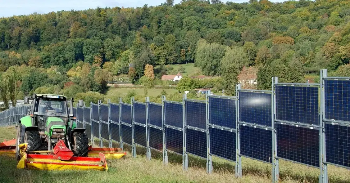
Starting to gain traction in Northwestern Europe, a solar fence is effectively a bifacial solar panel oriented East and West at a 90 degree tilt angle - forming a fence. What’s appealing about these panels is that they use about 10% of the land compared to conventional ground-mount solar, which is handy in space constrained parts of Europe. They also come with the added benefit of being a fence to help demarcate crops or keep livestock in.
We thought this was a pretty interesting concept and decided to spin up a project in Gridcog comparing a solar fence to a typical ground-mount solar system in London and Sydney and see what this does to energy yield and financial returns in the wholesale market.
Model overview
We created two scenarios in the simulation, one using conventional solar and one using a solar fence configuration similar to the image above. We then modelled sites in London and Sydney against both scenarios.
The conventional solar scenario used 100kWDC/100kWAC systems for both sites using mono-facial panels. London was oriented 180°South and Sydney 0° North, both with a tilt of 40°. For the solar fence scenario we used 100kWDC/100kWAC of bifacial panels. The systems were oriented 90° East/180° West at a tilt of 90°, so perpendicular to the ground.
We ran a one year model against Typical Meteorological Year (TMY50) irradiance data for each location.
To add a commercial perspective we exposed each site to the corresponding wholesale energy price for their region, so for London that was GB Day-Ahead for 2023 and for Sydney that was NSW Spot Price for 2023. The currency for the project was set to GBP to keep things comparable, so all AUD revenue is expressed in GBP at the current exchange rate.
Capex and opex costs are ignored for this exercise; we’re just exploring yield and revenue potential.
So, on to the results.
What does this do to energy yield?
Unsurprisingly the yield curve for the solar fence looks materially different to ground-mount solar. As you can see in the graph below there is more generation in the morning and evening, with a dip in what is normally the solar peak. There is still some generation in the middle of the day due to the prevalence of diffuse generation.

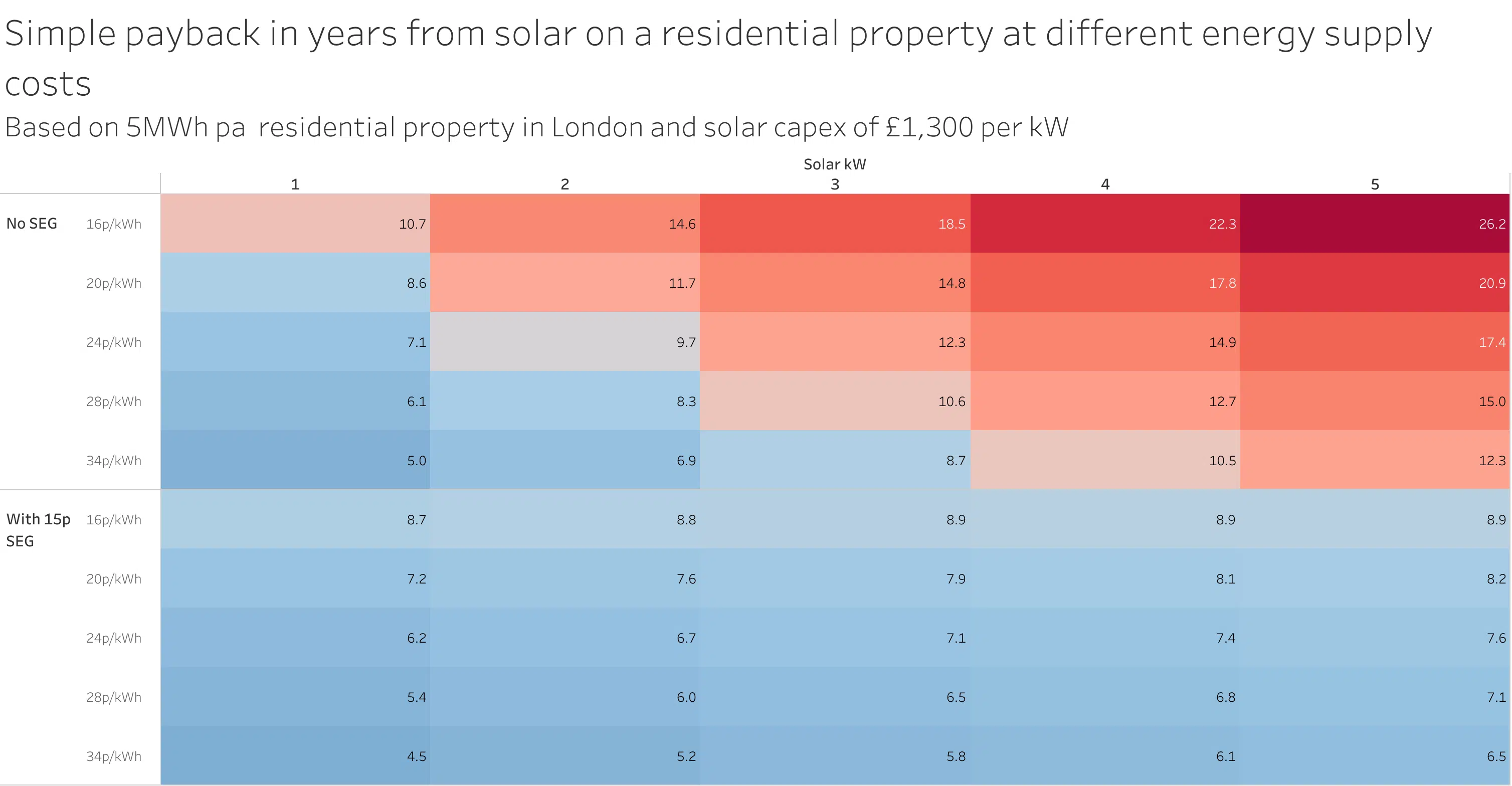
On an annual basis, overall yields are slightly higher for the solar fence than for the conventional system. We’re seeing a 10% total uplift in yield in London and a 3% increase in Sydney.

Whilst the physical performance might more or less align with what we’d expect, the commercial story is pretty interesting. More on that in a moment, but first a reminder of the changing dynamics in energy markets as the penetration of renewable energy generation increases.
Price cannibalisation 101
Price cannibalisation is when a surplus of renewable generation that has a short run marginal cost of zero, or sometimes below zero where the generation is subsidised or able to earn green certificates, causes wholesale energy prices to erode significantly. This often coincides with the solar peak.
Price cannibalisation is a growing feature of the energy transition with the UK experiencing 17 hours of negative prices in a row in July 2023 and parts of Australia experiencing entire days where the average spot price is negative; case in point in South Australia, in 2023 there were 44 days where the average price was negative, in general the market experiences weeks of predominantly negative prices in spring and autumn each year.
With increasing solar deployment, particularly on residential rooftops which are less likely to curtail with negative pricing, traders are becoming more concerned about price erosion in the middle of the day. Power trades in intervals that can be as granular as 5 minutes, with a different price attributed to power in each interval - this means that a MWh of power generated at midday will attract a very different price to that same MWh of power at 17:00 as the sun starts to go down.
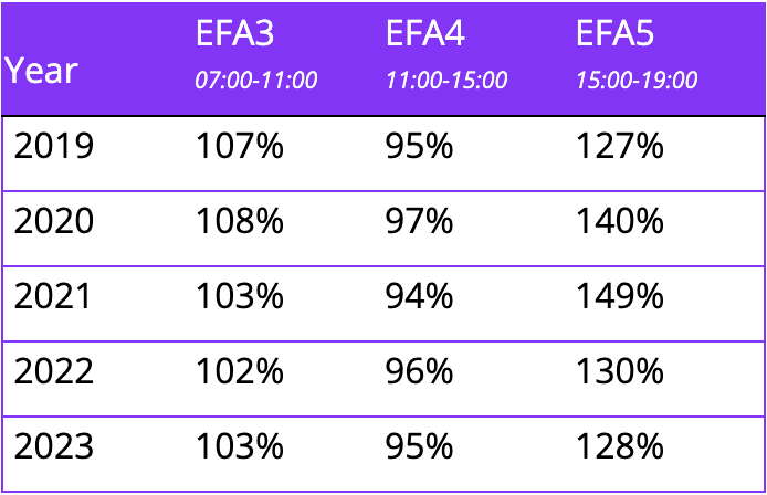
In the GB market power trades in half hour intervals but the power day can also be broken down into six four hour EFA blocks, these are common tradeable blocks on the over-the-counter market. EFA4 (11:00-15:00) is typically one of the lower value periods of the day due to lower demand and higher solar generation. EFA4 attracts a lower premium on the forward curve impacting the capture price of solar generation for PPAs. In the table below we’ve broken down the percentage to base load for EFA3-5 on the N2EX Day Ahead market over the last 4 years.
Back to the commercial analysis of our solar fence
The graph below is the same one we used to represent the daily energy yield shape but we’ve now included the average wholesale price (black trace) for each quarter of 2023 and then the total revenue captured by our solar systems against that wholesale price with London at the top and Sydney at the bottom.
You can see how dramatically the daily shape of the wholesale price impacts the revenue the solar systems can earn. This is particularly the case for Sydney where middle-of-the-day prices are on average much lower than prices earlier and later in the day. This is also apparent for the London site but to a lesser extent.
When these wholesale prices interact with our solar yield curves the solar fence really starts to stand out. It’s consistently able to capture much higher prices in the market on each side of the middle-of-the-day lows. Even in the UK with a less pronounced dip in midday prices the solar fence is still able to outperform conventional solar. This is most pronounced during the longer days of Q2 and Q3 where the solar fence is capturing more value from the higher priced EFA3 and EFA5 periods. This same principle applies to ground mount East-West solar systems, though is more pronounced with the solar fence due to the exaggerated tilt angle.

On an annual basis the advantage of the solar fence is even more obvious. The increase in revenue is significantly higher than the underlying increase in yield; in the case of Sydney a 3% increase in yield has translated into a 30% increase in revenue, highlighting how important timing is for that solar production, much more so than absolute generation.
The other thing that stands out in the annual revenue numbers is that London has totally outperformed Sydney for both our conventional solar and solar fence scenarios. That’s not a surprise to those who follow the energy markets but certainly goes against the conventional wisdom that Australia is a better place to own solar.

And how does this stack up around the world?
In our model the total solar yield increased in both London and Sydney and price cannibalisation is a feature of both the NEM and the GB power market.
There is more to consider including the capex cost of the solar fence versus a traditional ground-mount system, certificate revenue, land costs etc. Nonetheless, we think this is a pretty neat concept and look forward to seeing more solar fences modelled in Gridcog and on the ground in Europe and further afield.

Genna Boyle
January 8, 2024
.png)