
The latest Future Energy Scenarios from National Grid ESO anticipates a huge expansion in wind and solar capacity, from 35GW today to between 94GW-178GW by 2035. It envisions a critical role for distributed energy, smart charging, vehicle-to-grid (V2G), and demand-side flexibility - all key behind the meter themes. The business case and market size for behind-the-meter assets is getting stronger.
Industry Thoughts
Emissions Go Down
The carbon intensity of an energy market, measured in grams of carbon dioxide per kWh of energy (gCO2/kWh), is a measure of the environmental impact of consuming electricity from the grid.
Different types of generating plant have different emissions intensities, with oil and coal-fired power stations having the highest emissions intensities, and renewables (including hydro-electric) and nuclear having emissions intensities of zero.
As the energy transition progresses the overall grid emissions intensity should (and must) reduce. In this article we take a look at the changing grid carbon intensity of the UK and eastern Australian grids and dive into what the drivers of this are.
A Milestone
The UK recently celebrated a few milestones which saw average grid emissions intensity fall to record lows. For Q3 2023 the amount of greenhouse gas emissions generated for each kWh of electricity generated fell below 150 gCO2/kWh (0.15 tCO2/MWh) for the first time, with the lowest ever carbon intensity recorded on the 18th of September 2023 at 27 gCO2/kWh. This is a significant achievement and demonstrates the progress that the GB grid has been making as it has shifted away from coal and is further decreasing the use of natural gas-fired generation.
In fact, the emissions intensity of the GB grid has declined by roughly 40% over the last decade.
The GB grid used to be dominated by coal fired generation, with over 100 TWh pa of generation coming from coal up until 2014; by comparison in 2020 this was only 0.55 TWh. The government is planning to phase out all coal-fired generation by the end of 2024, with only one active coal-fired power station currently connected to the grid (Ratcliffe).
So, why was Q3 2023 so clean in the UK?
High intermittent renewable generation coupled with lower demand made Q2 and Q3 the lowest carbon intensity quarters of the year in the UK, with wind output up 20% in Q3 2023 compared to last year. Over the last 10 years the buildout of renewables, particularly wind, has been huge; in 2022 wind generation accounted for almost 27% of the generation stack.
This year has seen a trebling of distributed solar buildout coupled with large offshore wind farms coming online, including the world’s largest offshore wind farm Doggerbank producing it’s first MWh of power in October 2023. Based on these trends expect further carbon intensity emissions records to be broken in 2024.
Let’s put this achievement in perspective and see how our Australian cousin compares.
The Antipodes
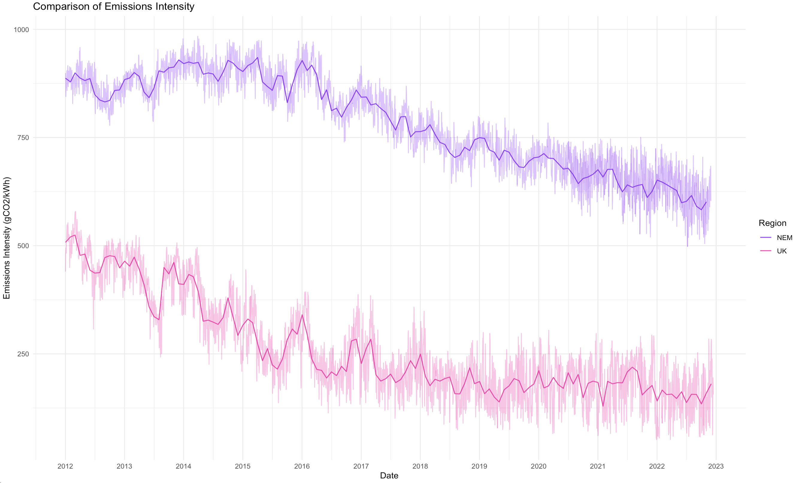
The chart above shows the emissions intensity of the both the GB grid and the National Electricity Market (Australia’s primary electricity market serving the populous east coast) over the last decade.
The lighter shaded lines are the daily average grid emissions intensities, and the darker lines are the monthly average grid emissions intensities. Overall Australia’s NEM is 2-3 times dirtier than the UK, which isn’t completely surprising given its reliance on coal-fired generation and lack of nuclear power.
However, the story for the NEM is a little more complex. The NEM consists of five regions, reflecting the major states constituting the NEM. Each of these regions have different generation mixes and looking at the emissions intensities of each region is a very different story.
- Tasmania (TAS1) is dominated by hydro-electric power, with some wind, a bit of gas-fired generation, and some solar. They ditched coal a long time ago. The increased emissions they experienced around 2015-2017 can largely be attributed to an extended Basslink outage (separating them electrically from the mainland) which required diesel generators to be flown in. This also coincided with mild drought conditions and low dam levels, reducing hydro-electric availability and generation.
- South Australia (SA1) is the poster child of a renewables-heavy grid. Their emissions intensity path looks remarkably similar to that of the UK – emissions averaged around 500 gCO2/kWh a decade ago and with the closure of their last coal-fired power stations, Northern and Playford in 2015-16, have been on a steady downward trajectory with the increasing penetration of wind and solar. What is interesting however is the large daily spreads in average grid emissions intensities. Periods of low renewable generation can see South Australia dominated by gas-fired generation; on the other side South Australia has been consistently breaking records for renewable generation and has achieved periods of over 100% renewable generation (including exports).
- New South Wales (NSW1) and Queensland (QLD1) both have a similar make-up of generation dominated by bituminous (black) coal generation. They’ve improved emissions intensity over time, but there’s still a lot of work do. What’s also interesting is how tight the monthly average is to the daily averages – because the grids are dominated by gas and coal there’s a relatively small spread. Only very recently has this started to change with the increasing penetration of renewables.
- Victoria (VIC1) has the dirtiest grid in the NEM, relying on lignite (brown) coal. As older coal-fired stations have closed the state has gotten progressively greener, supported by a large numbers of new renewables projects coming online. Over the last decade the emissions intensity has improved by nearly 40%. So while Victoria still has a way to go, they’re making progress!

How Low?
It’s clear that both electricity systems are getting greener, with both grids seeing average emission intensities dropping by 30-40% over the last decade. As the transition continues these intensities will continue to decline; the questions are just by how much and how quickly?
It’s also interesting to note that National Grid ESO has an app and dashboard explicitly highlighting the current emissions of the grid. There is no such equivalent in Australia, however third party platforms shows some of this data, and the raw data used to build these charts does exist in AEMO’s database. The existence of an official dashboard maintained by the system operator however does seem to speak to national priorities.
In May 2023 the Australian Energy and Climate Change Ministerial Council (the governing body responsible for the NEM) finally agreed to amend the National Electricity Objective to include an emissions reduction objective. The NEO is the purpose statement for the NEM, and this action is a clear signal that Australia is finally beginning to take some of this stuff more seriously.

Alex Leemon
December 20, 2023

